Case study
R M Faulkner: from a holding page to a proper website for a Ruthin haulier
A Ruthin hay, straw and haulage firm had been sitting on a builder's holding page for years. We gave them a fast, modern one-page website in the colours of their lorries, built to be found on Google.
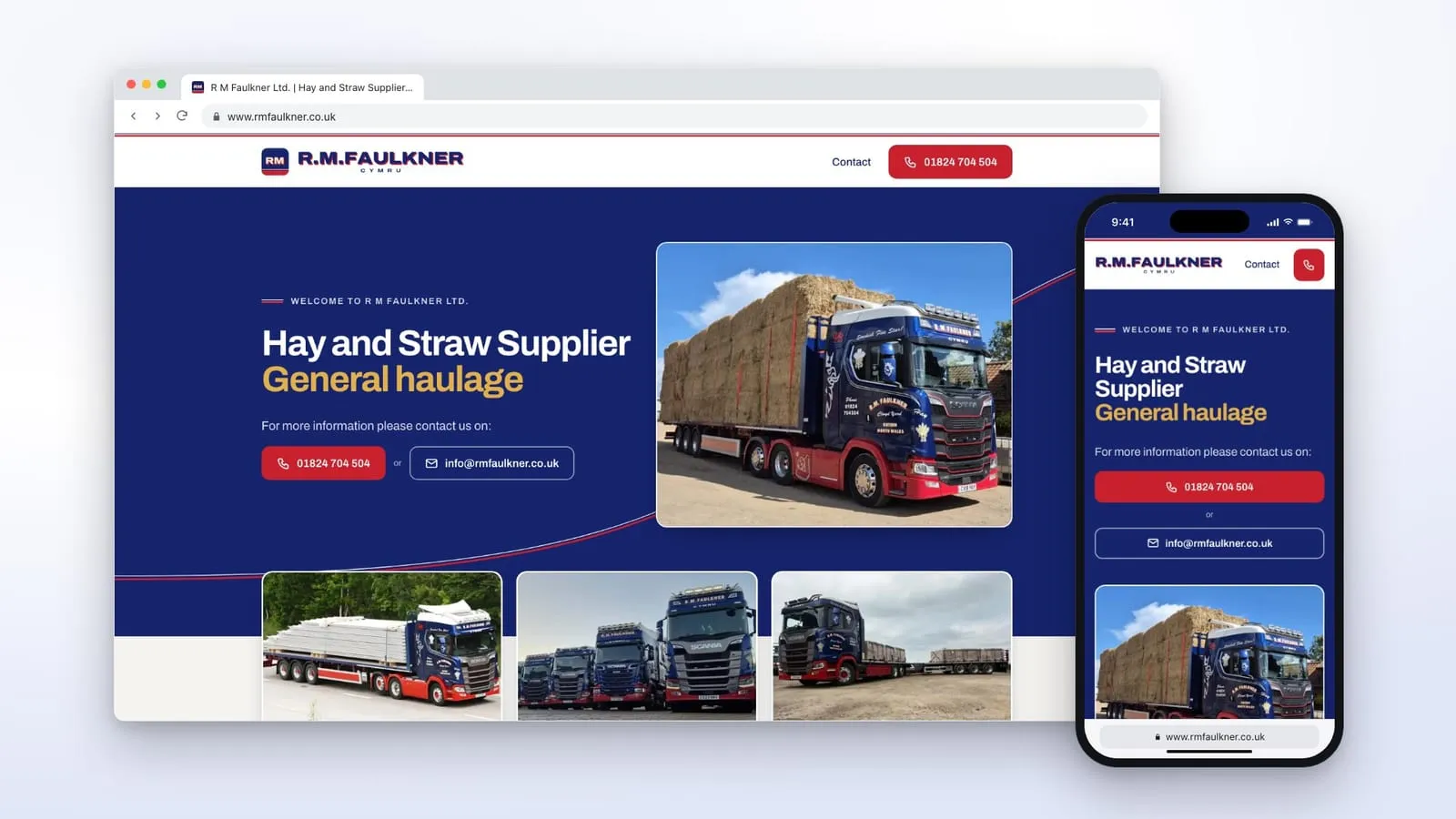
- Hay, straw and general haulage
- Ruthin, Denbighshire
About R M Faulkner
R M Faulkner Ltd supplies hay and straw and runs a general haulage business from Clwyd Yard, on the Lon Parcwr Industrial Estate in Ruthin. Their lorries are hard to miss: mostly navy Scanias with red chassis, cream lettering, “CYMRU” across the headboard and loads of straw, steel or bricks on the back.
Where they started
For years, their web address led to a holding page made with 123-reg’s website builder. It opened with “Welcome to the R M Faulkner Ltd. holding page while our website is under construction”, and that’s more or less where it stayed.
- It looked dated. One photo, a line about what they do, a phone number and an email address. It didn’t look anything like the lorries.
- It struggled to show up on Google. Beyond its one line of text, the page gave Google almost nothing about the firm, where the yard is or how to reach them.
- There was room for the basics. There was no privacy policy or terms page yet.
What they asked for
They asked us to replace the holding page. They wanted to keep it to one page, but modern, very fast and set up properly for Google.
We kept their own words. Every line on the new page is from the old one, apart from the “under construction” welcome, which stops being true the day the new site goes live. They’d already said what the business does, so they had nothing new to write.
Designed off the side of the lorries
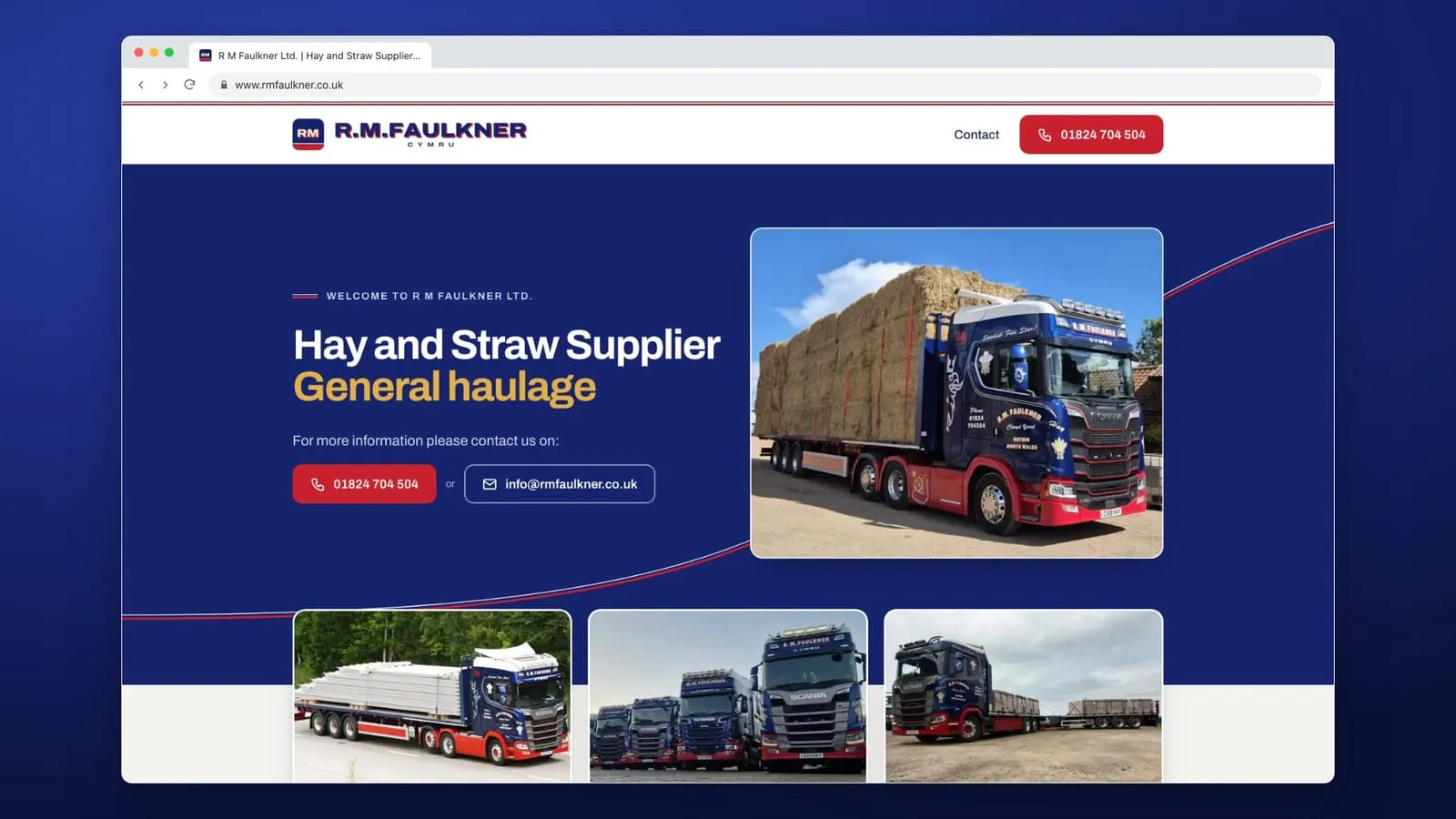
There was no logo file to work from, so we redrew it from photos of the lorry headboards: the RM badge, the name and “CYMRU” underneath. Then we took the rest of the design from the paintwork too.
- The colours are the livery. Cab navy for the page, chassis red for the buttons, and the straw gold of the load on the “General haulage” line.
- One fine line ties it together. A thin red and white pinstripe, like the coachline on the cabs, sweeps up the page behind the lorry. It’s the one flourish on the page, echoed in small marks beside the headings.
- The photos frame the words. The lorries sit beside the text and along the edge of the navy, so the page looks like their yard.
- Calm, modern lettering. We tried their wide headboard lettering for the headings first, and it was too much on a screen. It now lives in the logo only, and the headings are clean and easy to read.
We went through a few versions before it felt right: too much trucking look at first, then too plain. The one that went live is simple, and you’d still know whose it was with the name covered up.
Their photos, their work
Every photo on the site is their own. We started with pictures from their Facebook page. Once they’d seen the early version, they asked if we could show more of the haulage side as well as the hay and straw, and sent over a batch of photos of recent jobs: steel panels on the motorway, bricks on a drawbar trailer, a load of steel coil and a lorry full of straw at sunset.
We cropped the strongest ones to fit, swapped them in, and kept the rest to hand for later.
Easy to get in touch
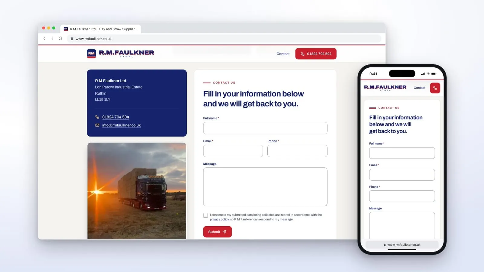
- The phone number is never more than a tap away. On a phone, the call button sits in the header all the way down the page.
- The contact form is on the page. Enquiries go straight to their own inbox, and we sent a test through before handing it over.
- The old contact page address still works. Anyone who saved it, and Google’s record of it, now lands on the form.
- The address and phone number are the same everywhere on the site, including the behind-the-scenes details Google reads, so it can tell it’s the same firm at the same yard.
We also wrote a privacy policy and terms for them, which they read and signed off, and the footer shows the company number and registered office, which a limited company’s website has to show.
Fast on any phone
Plenty of the people looking them up will be on a phone, and not always somewhere with a good signal. So we kept the page light.
The first screen, photos and all, comes to under 200KB, a fraction of the size of a single photo straight off a phone. The photos are sized to the screen, and the ones further down only load when you scroll to them. Because of the way we build our sites, there’s no software behind it to slow it down, update or go out of date.
Built to be found
The page now tells Google clearly what the firm is, what it does and where it is: a proper page title and search description, the business name, address, phone number and Facebook page all set out the way Google likes to read them, and a secure connection (the padlock in the address bar).
Moving the address across
The domain stayed with 123-reg, and their email stayed exactly where it was. We changed only the two settings that point the web address at the new site, backed up everything else first, and checked their email settings were exactly as they were before and after. Their email carried on working throughout.
Looked after from here
R M Faulkner has nothing to log in to, learn or update. If they want new photos up, a change to the wording or a new page one day, they send us a message and we make the change.
This is our single page website, for a business that only needs one good page.